
North of Anna branding
I made this in 2017. The store sold Scandinavian designed items in a shop in England. They wanted a brand to reflect who they were.
Sadly the store isn’t up and running anymore.
The brief: It should feel Scandinavian and modern, holistic, well designed, inviting, warm and sustainable.
The solution: Look below


The structure of the logo is based on the N, the O and the A in the name North of Anna. It also makes mountains with snow - like the north. This part of the logo is also found in the pattern.
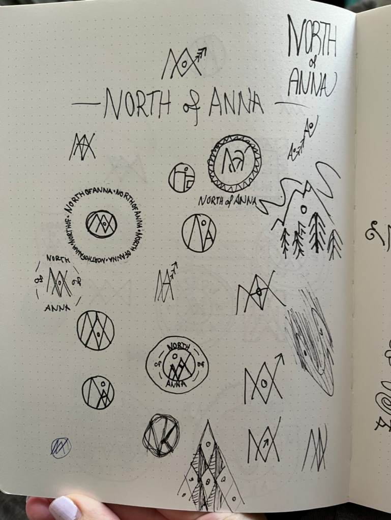
The ideation and sketches when making the logo.
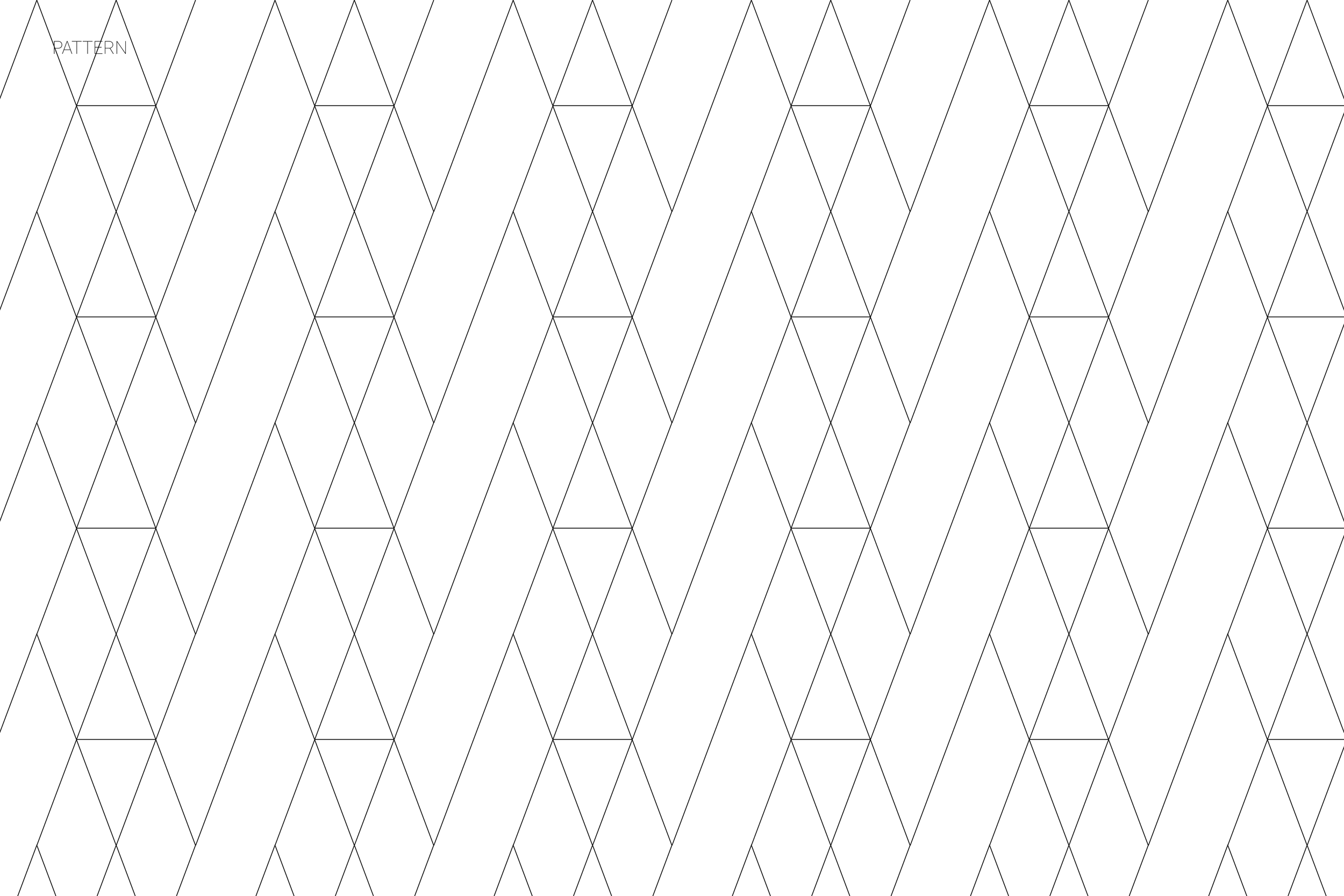
The pattern is made from the parts of the logo. It can be used to make wrapping papper, bags and packages

The font Didot is used to break up the straight lines of the logos pictogram.

The main colours is black and white. This is because the design of the products sold is what needs to have room to speak to the customer, not the logo of the store. But, the black and white still gives contrast and readability. The beige, yellow and blue is used and picked up here and there in the paper bags and boxes, the tones of the photos of the products and details on the web shop (which isn't being used anymore).
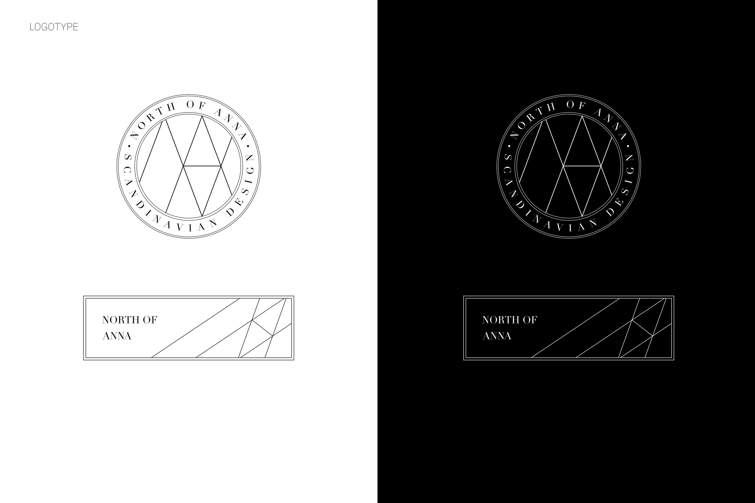
The logo is giving a clean scandi look with the pictogram in the middle or on the side.

The photos of the products are clean and simple and can be found in the colour scheme for the brand.

The sign gives the brand a high end look. The gold in the frame is found in the brands colour scheme too.