
The Oh!Garden brand
The brief: Make a modern, soft and nature inspired logo and colour scheme for a new gardening app.
The solution: Look below
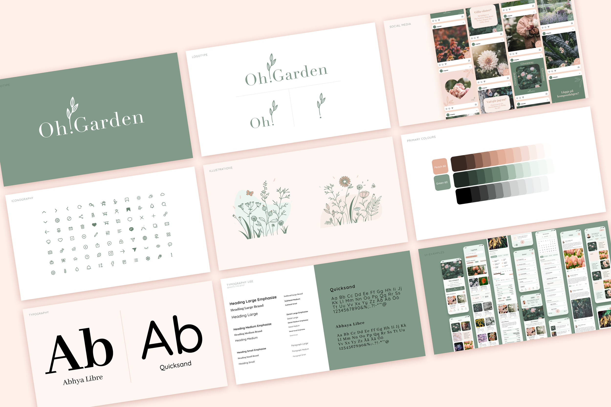
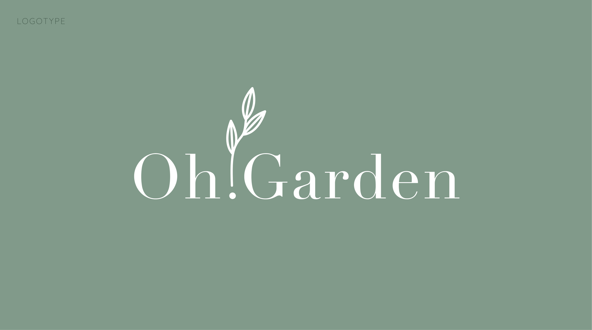
The name of the company is Oh!Garden with the exclamation mark. I thought of the dot as a seed that something grows from. One of Oh!Gardens catch phrases are "Come and grow with us!". It works perfectly together with the logos meaning and how it's built. I chose the font Didot for the logo. It gives a clean modern look but still flirts with the gardening feeling that so many brands have. It feels flowy, soft and organic without feeling home made and messy. The logotype sticks out from other gardening companies and apps which is so much the point.

The logotype can be used in different variations. Just using the Oh! is okay but also the exclamation mark all by itself. It makes it easy to get recognition when being able to use only the leaves in certain places and backgrounds.
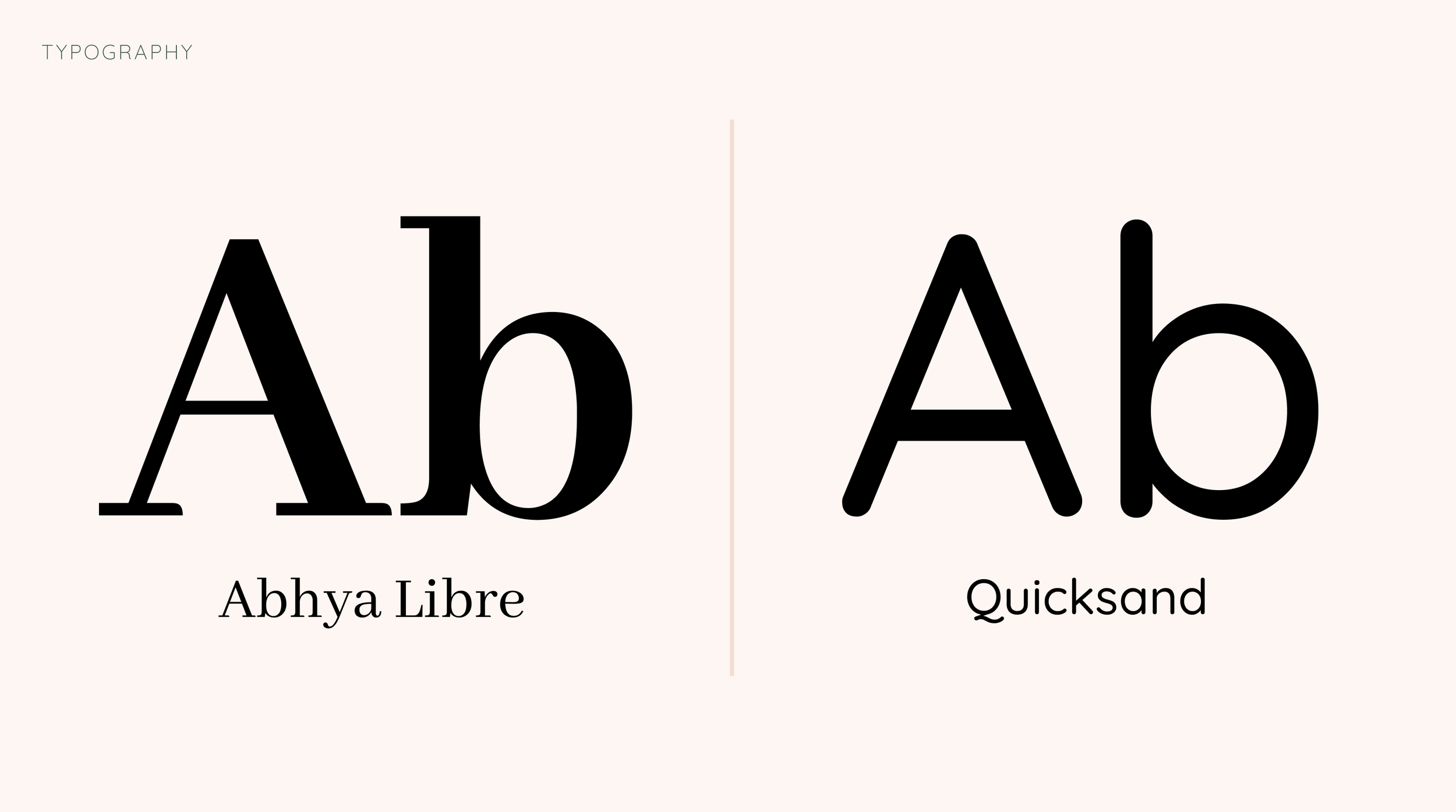
The fonts used in the app (Didot was too expensive for a startup) is Abhya Libre as a heading font and Quicksand as a paragraph font. Abhya Libre is a bit more easy to read than Didot but resembles it. You still get the brands look and feel in the app. Quicksand resembles the popular handwritten fonts so many gardening companies use. But, as explained before, Oh!Garden wanted something more modern so this font really fits the brief.

I made simple icons that are easy to draw and make new ones. They are both filled and outlined. Again, simple and modern that works with the fonts.

The illustrations are used on empty states and on backgrounds. They bring depth and a meadowy feel to the app. They use the outline feel like the icons but can also be filled with different colours from the colour scheme. Also areas without outlines are okay to use.

The colour scheme is based on one soft green and a soft peach colour. The colours connection to earth and greenery is obvious but nudged towards a modern take. A bit colder green and peach. There are complementary colours too of course, with yellow, blue, purple and red. They are used sparingly to make different areas in the app to pop.

The typography is built with semantic type. The base is the fonts and their typefaces they are then connected to somewhat agnostic type-namnes. They have the same setup in Figma as in code. This means that we can change the Heading Large Brand type in one place in the code and it will change on all the places where heading-large-brand is used.
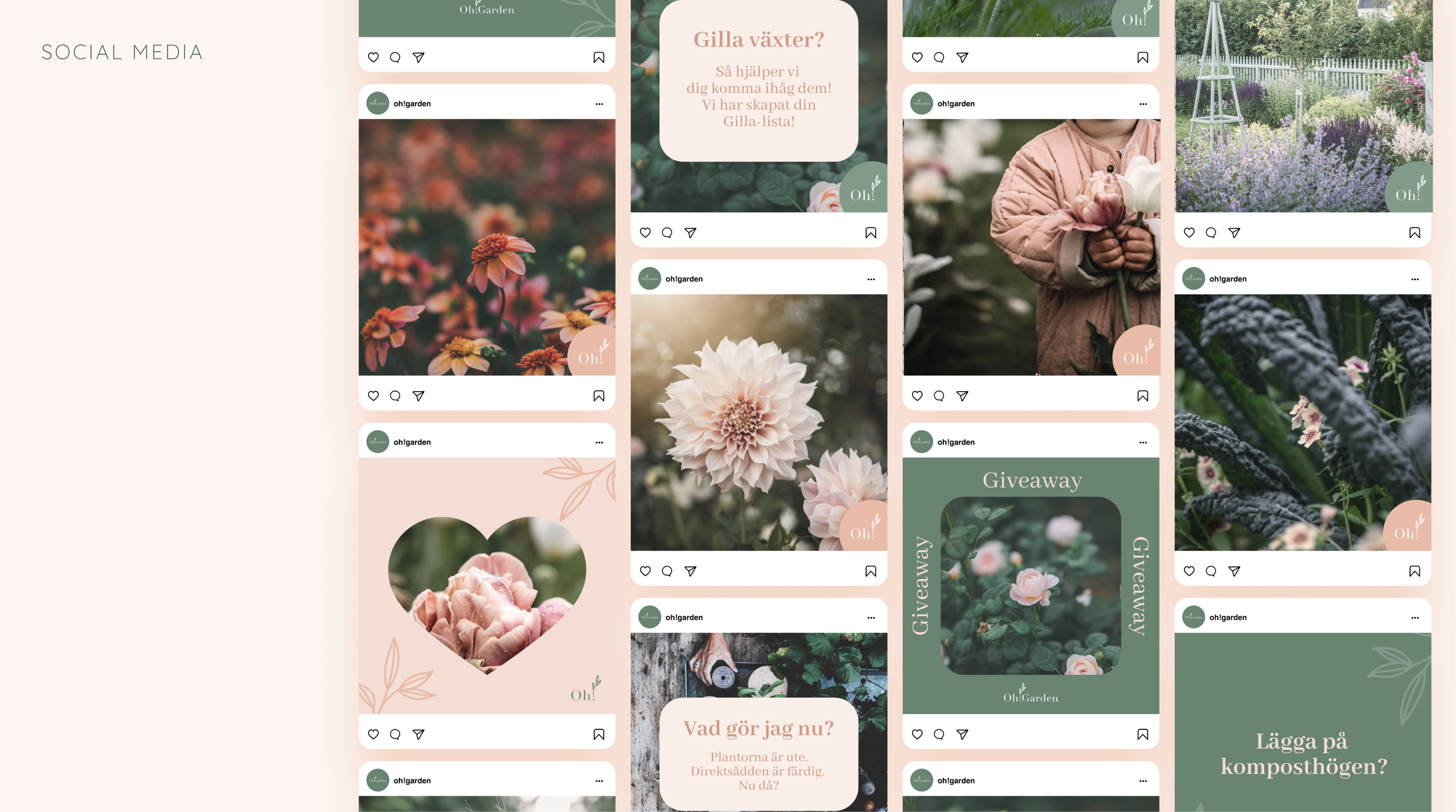
The social media presence accumulates and uses all the different parts of the brand book. Colours, type, the photographs look, feel and tone, logotype etc. Here we can see it all come together.

The same goes for the UI design. Perhaps a little less peach but still very much on brand. Call to actions uses mainly the peach colour but sometimes the green depending on hierarchy.